Mittwoch, 14. Januar 2009

Delicious (Exlijbris, Jos Buivenga)


Jos: »The Delicious is a font I designed because of my admiration for typography. It got a bit out of hand and in two years it resulted in a complete font family. Every character has a unique shape. Consistency in spacing, not in the character shape. The Delicious italic is not a slanted roman, but a true italic. Special attention was given to character spacing to obtain a homogenic eappearance. With it's relatively large x-height the Delicious can be used for text in smaller point sizes. All weights have exactly the same line length. «

Anivers (Exlijbris, Jos Buivenga)


Jos: »I wanted Anivers to be a robust and rigid font, forgiving, flexible and elegant... and also suitable for a broad use: from a stationery to a poster headline. From an intro in a magazine to a base for a logo. This OpenType font family comes in regular, italic, bold and small caps and has some nice OpenType features. Besides ligatures, contextual alternatives, fractions, oldstyle/tabular numerals, Anivers also has a 'case' feature for case sensative forms and tabular numerals ... so Anivers can crunch numbers with ease. Each Anivers font contains more then 400 glyphs ... even Esperanto is supported. « And even an versal Esszett is included.

Fontin (Exlijbris, Jos Buivenga)


Jos: »The Fontin is designed to be used at small sizes. The color is darkish, the spacing loose and the x-height tall. Don't forget to check Fontin Sans! The numbers of the Fontin have a 'hybrid' design. They carry the characteristics of medieval numbers, but their size is larger than the x-height. The Fontin italic is not a slanted roman, but a true italic.«

Fontin Sans (Exlijbris, Jos Buivenga)


Jos: »I've designed Fontin Sans to be a suitable sans companion of Fontin. With a nice classical appearance it will be a perfect match. Fontin will be rereleased in OpenType format (soon) as Fontin Semi (with a Bold Italic) to match new metrics an kerning. Be sure to check back once a while.«

Giant Head (Blue Vinyl)


Giant Head by Blue Vinyl. This slab serif font was hand-drawn to an extreme weight. There are two fonts, Giant Head & Giant Head Two. They are layered on top of each other in your graphics program or if you like just use the regular version.

Synthetique (Blue Vinyl)


Dotted freefont Synthetique by Blue Vinyl.
»Designed as a bitmap font using Fontlab's Bitfonter and then converted to an outline font. Synthetique has been optimized for on screen display at 17 pts. When your using this font at 17 pts be sure that anti-aliasing (smoothing) is turned off in your graphics program. Otherwise, I recommend using this font at 24 pts or above with font smoothing on. It looks great printed at any size.«

Autobahn.nl


3 Type-Experimente von Autobahn.nl. Heldentica wurde mit Zahnpasta geschrieben, Tomatica mit Ketchup und Gelvetica mit Gel. Ausgangsbasis war immer die Helvetica.

Dienstag, 13. Januar 2009

advent (inde-graphics)


Advent by inde-graphics. Quote: »Want candy for your font folder? advent pro FINAL by =inde-graphics has an elegant style of class. It is both modern and stylish. This font makes excellent use of type as it will make any page not only aesthetically pleasing, but legible, user-friendly and easily navigable.« And it comes in 7 weights.

Stahlbeton (Patric Schwarz)

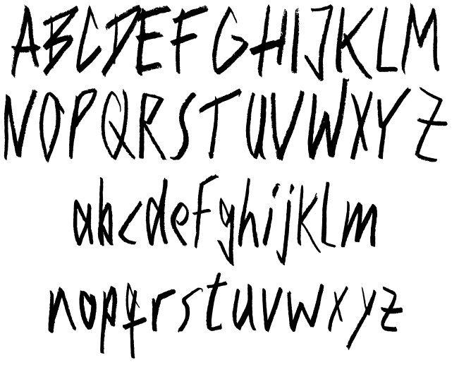
Stahlbeton von Patric Schwarz.

Lahmer Hund (Christian Büning)

Christian Büning: »Wenn es eine krakelige Handschrift gibt, dann die von Stefan Wolf! Der kräftige Bleistiftcharakter macht sich prima in Überschriften für Kinderbücher oder als Plakatschrift. Die Handschrift hat mir auf Anhieb gefallen, daraus wollte ich unbedingt eine Satzschrift machen. Hier ist sie. Download und Verwendung ist frei, ob kommerziell oder nicht. Wem die Schrift gut gefällt, den bitte ich, sein Wohlwollen durch eine Spende bei den Ärzten ohne Grenzen ausdrücken.«